●  BOOKING NEW PROJECTS

INDEPENDENT DESIGN & BUILD STUDIO

BHOPAL → WORLDWIDE

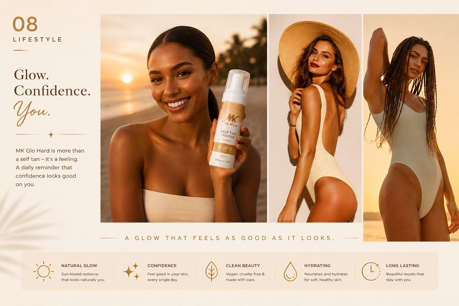
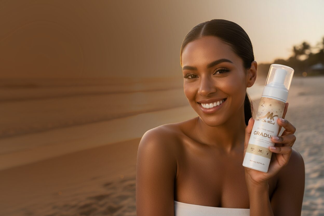
A woman on a beach at golden hour holding a bottle of Glo Hard Gradual self-tan mousse.

Glo Hard had a formula. Fifteen days later, it had a brand.

A US self-tan startup arrived with a finished formulation and nothing around it. No mark, no packaging, no store, no words. Here is what the fifteen days actually looked like.

Client
Glo Hard
Market
United States
Year
2026
Timeline
15 days
Made with
Illustrator, Photoshop, Shopify, After Effects
Day 01–02The shelf

Read the category before drawing anything.

Self-tan is a crowded aisle and it looks it. Almost every brand reaches for the same bronze gradient, the same beach, the same promise. Glo Hard needed to look expensive enough to sit beside the incumbents on a bathroom shelf, and unlike them enough to be worth picking up.

That gave the build one constraint everything else answered to: warm and premium, but never generic beauty beige.
Day 03–05Identity

A wordmark that has to survive a thumbnail.

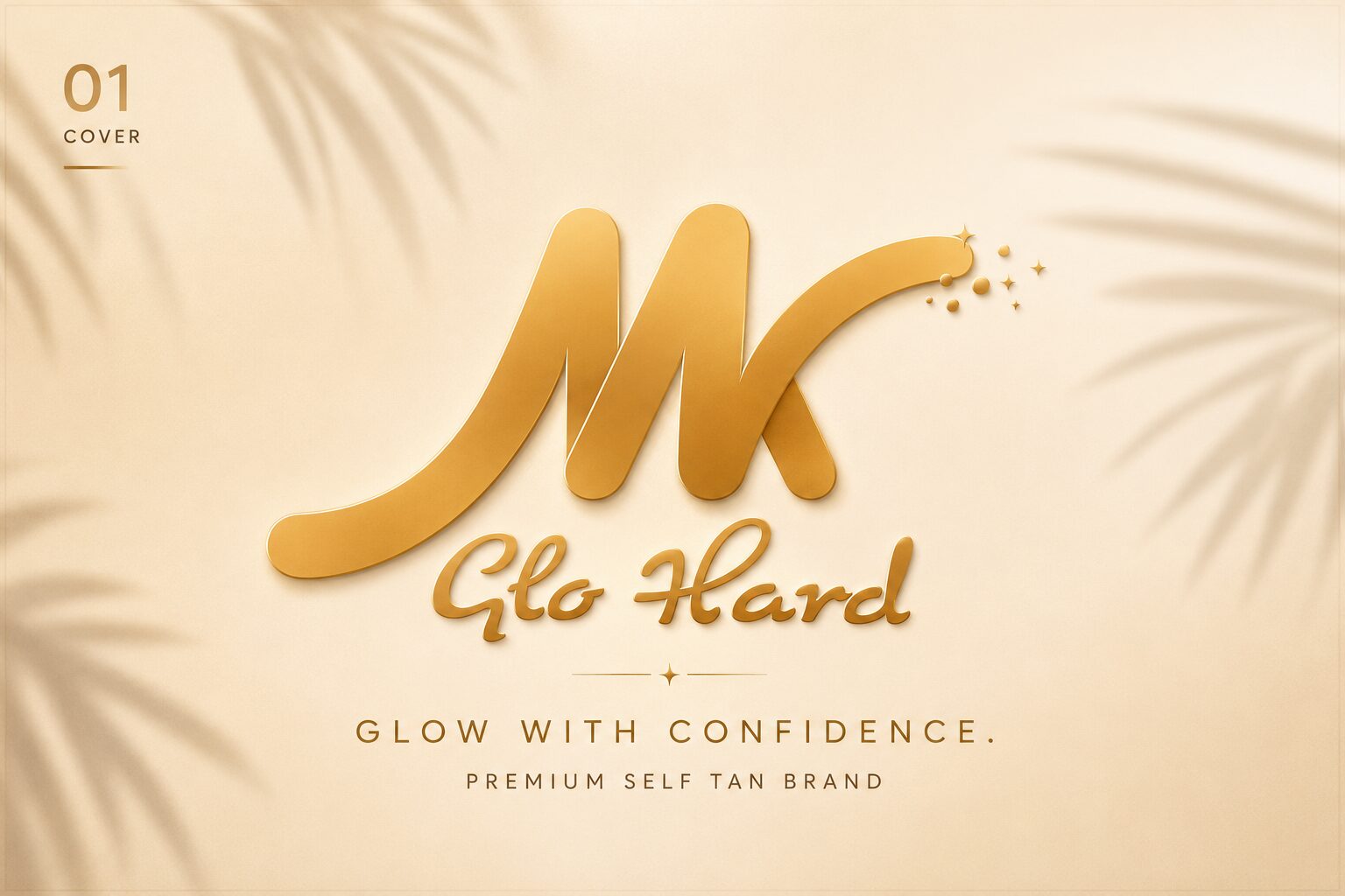
The mark is a script, drawn heavy enough to hold at the size of a product listing and loose enough to read as beauty rather than supplement. It is gold because the product's entire promise is what light does to skin — the mark makes the claim before a single word does.

The Glo Hard gold script wordmark with the line Glow with confidence.
The primary mark with its tagline lockup. Palm shadow is a photography treatment, not part of the mark, so the logo stays usable on packaging at any size.
Day 05Palette

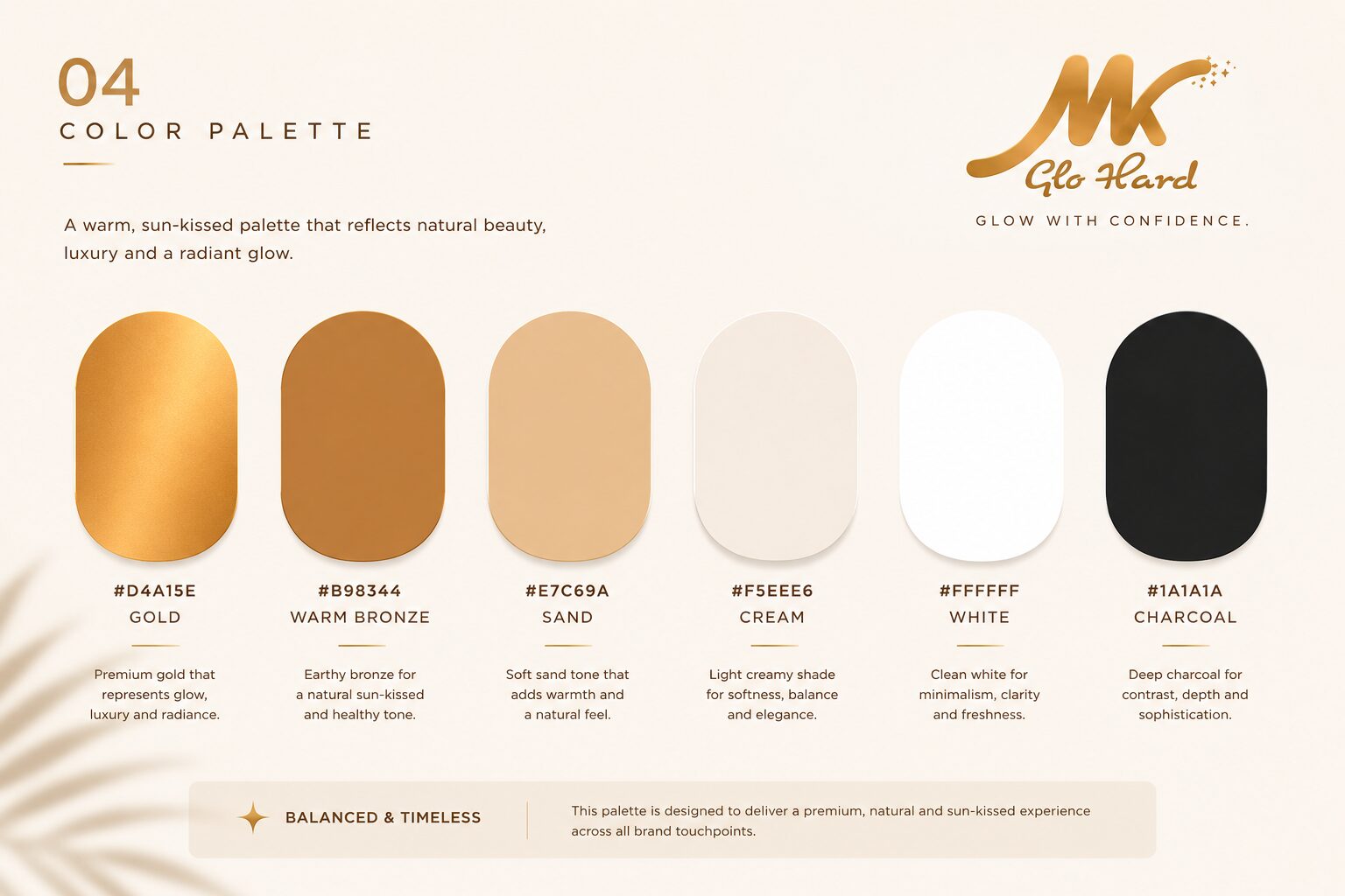
Six values, fixed early, so the rest could run in parallel.

With a fifteen-day build there is no time for packaging and the store to drift apart and be reconciled later. The palette was locked on day five and everything downstream was built to it.

  • Gold#D4A15E
  • Warm bronze#B98344
  • Sand#E7C69A
  • Cream#F5EEE6
  • White#FFFFFF
  • Charcoal#1A1A1A
The Glo Hard brand board showing six palette values with their names and hex codes.
Section four of the brand guidelines. Gold and warm bronze carry the brand; sand and cream give packaging room to breathe; charcoal does the typographic work so the gold never has to.
Day 06–09Packaging

Three strengths. One shelf.

The three mousses had to read as one family from ten feet away and as three distinct products in the hand. Everything on the 200 ml bottle stays fixed — mark, layout, the PETA and vegan badges along the base — except the band. Its depth is the strength, so a customer reaching for a repeat purchase never has to read the label.

  • Gradual

    Builds over repeated use. The palest band, closest to the cream of the bottle.

  • Medium

    The middle of the range and the default first purchase.

  • Dark

    Deepest band, closest to charcoal, for customers who already know their shade.

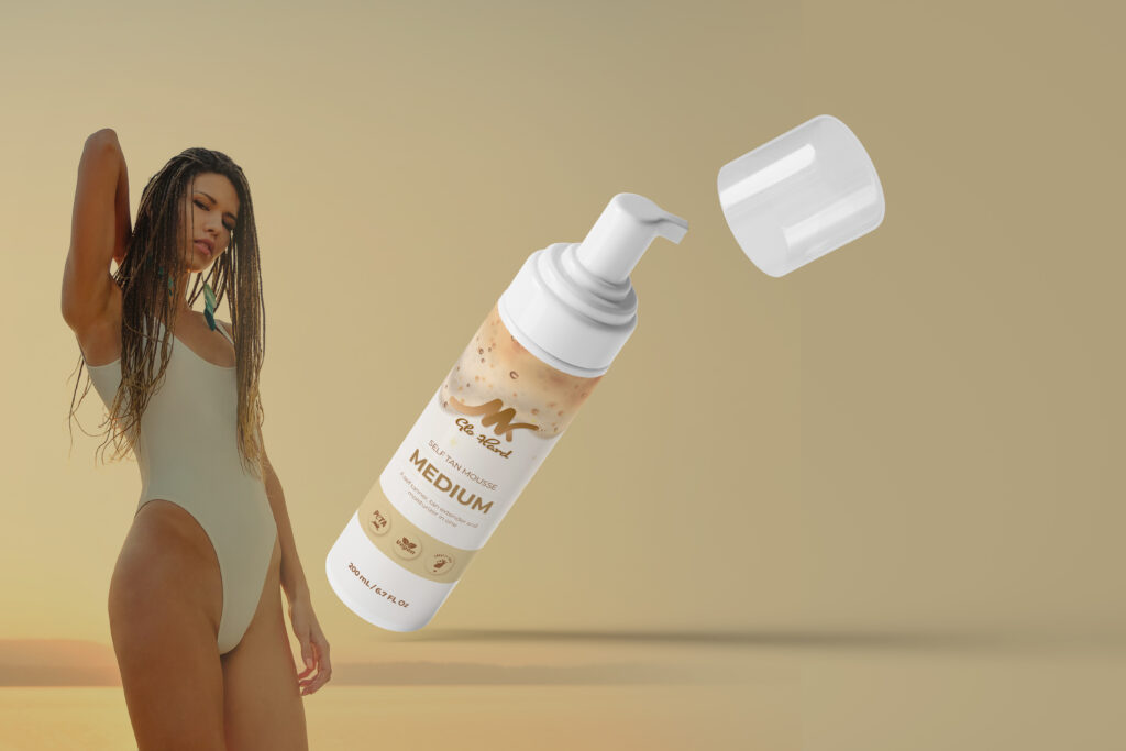
Glo Hard Medium self-tan mousse bottle photographed on a neutral background.
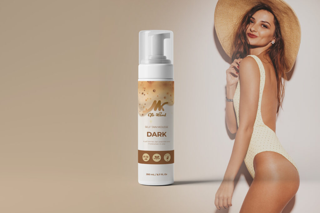
Glo Hard Dark self-tan mousse bottle photographed on a neutral background.
The product film, eight seconds, built to run as a single asset across the store and paid social. One visual language, three strengths, no separate shoot per variant.
Day 10–12Store

A store built around four decisions, not four pages.

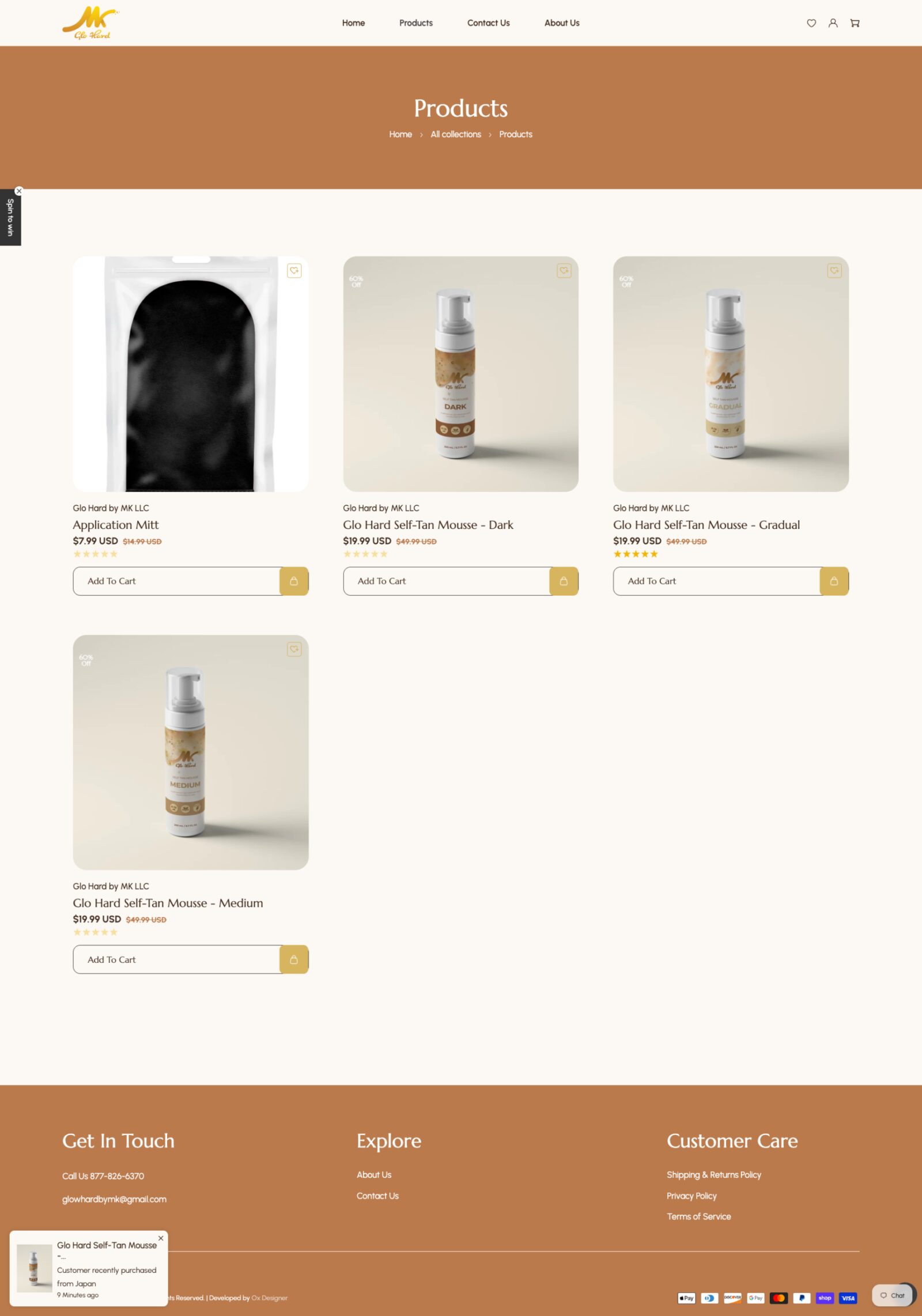
Shopify, structured around the only choice a first-time visitor actually makes: which strength. Three mousses at $19.99 and the application mitt at $7.99, with the collection page doing the ranging so product pages could stay short.

Photography, listing copy and layout were all made to the same palette, which is why nothing on the page looks bought in.

The Glo Hard Shopify products page showing four products with prices.
The live collection page. Every word on it, including the product descriptions and the policies, was written as part of the build.
Day 13Words

Every word on the site was written, not borrowed.

Product descriptions, the benefit set, shipping and returns, the About page, the microcopy on the cart. Beauty is the category where competitor copy gets recycled hardest, and a formulation claim inherited from someone else's label is a liability as much as a cliché.

Writing it alongside the packaging meant the bottle and the product page make the same promise in the same voice — which is difficult to arrange when the words are ordered separately after the design is done.

Day 14Photography

A direction the client can keep shooting to.

Golden hour, real skin, the bottle held rather than staged. The point of writing the direction down was that it outlives the launch: every shot the client takes next lands in the same place without anyone needing to re-explain the brand.

Glo Hard lifestyle photography with the product benefit set in gold line icons.
Lifestyle photography with the benefit set — natural glow, confidence, clean beauty, hydrating, long lasting — carried in the same gold line icons used across the store.
Day 15Live

Idea to live store in fifteen days.

A brand that did not exist two weeks earlier went live ready to sell, with identity, guidelines, packaging, film, store and copy all made by the same person. Nothing was handed between freelancers, so nothing had to be made to match after the fact.

View the live store

What shipped

  • Brand identity & positioning from a blank page
  • Packaging design for three mousse variants
  • Full Shopify e-commerce build and design
  • All website copy and product content research
  • Product photography direction and mockup styling

Next case study

OUPI

See all work