●  BOOKING NEW PROJECTS

INDEPENDENT DESIGN & BUILD STUDIO

BHOPAL → WORLDWIDE

A helmet, a crack, one red. Built from a single line in the brief.

Crushed Helmet Creations is an upcoming dark-fiction imprint. The brief was one sentence: a minimalistic front-facing motorcycle helmet with a cracked visor. Dark, mysterious, bold, and it had to work in print and on screen.

Client
Crushed Helmet Creations
Market
United States
Year
2025
Timeline
2 rounds, approved after one revision
Made with
Illustrator, pencil
Step 01Brief

One sentence to start from.

The whole brief was a line: a minimalistic front-facing motorcycle helmet with a cracked visor. Around it, a feel (dark, mysterious, bold) and an avoid list (no pink, no bright colours, no Comic Sans or Arial, nothing overtly feminine).

The mind map turned that into an idea. A helmet hides the rider, a crack means impact. A hidden face that has been broken, in black with one blood red.
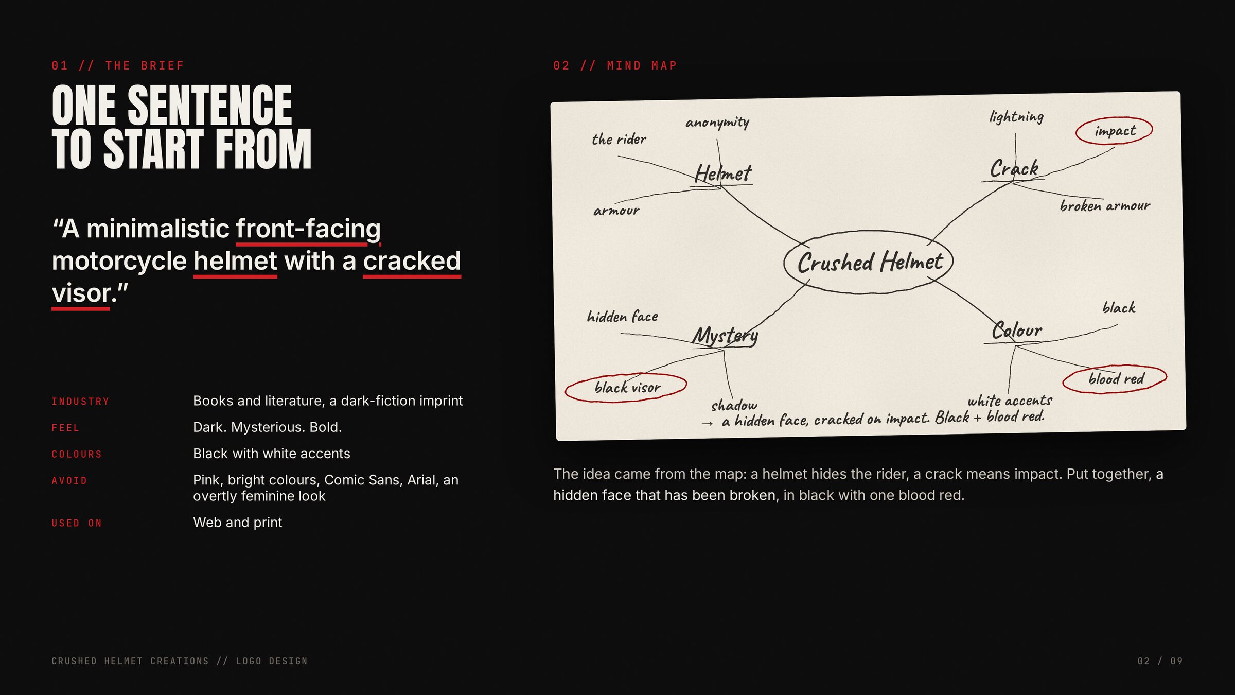
Crushed Helmet brief and mind map
The brief, and the mind map it became.
Step 02Research

What I looked at.

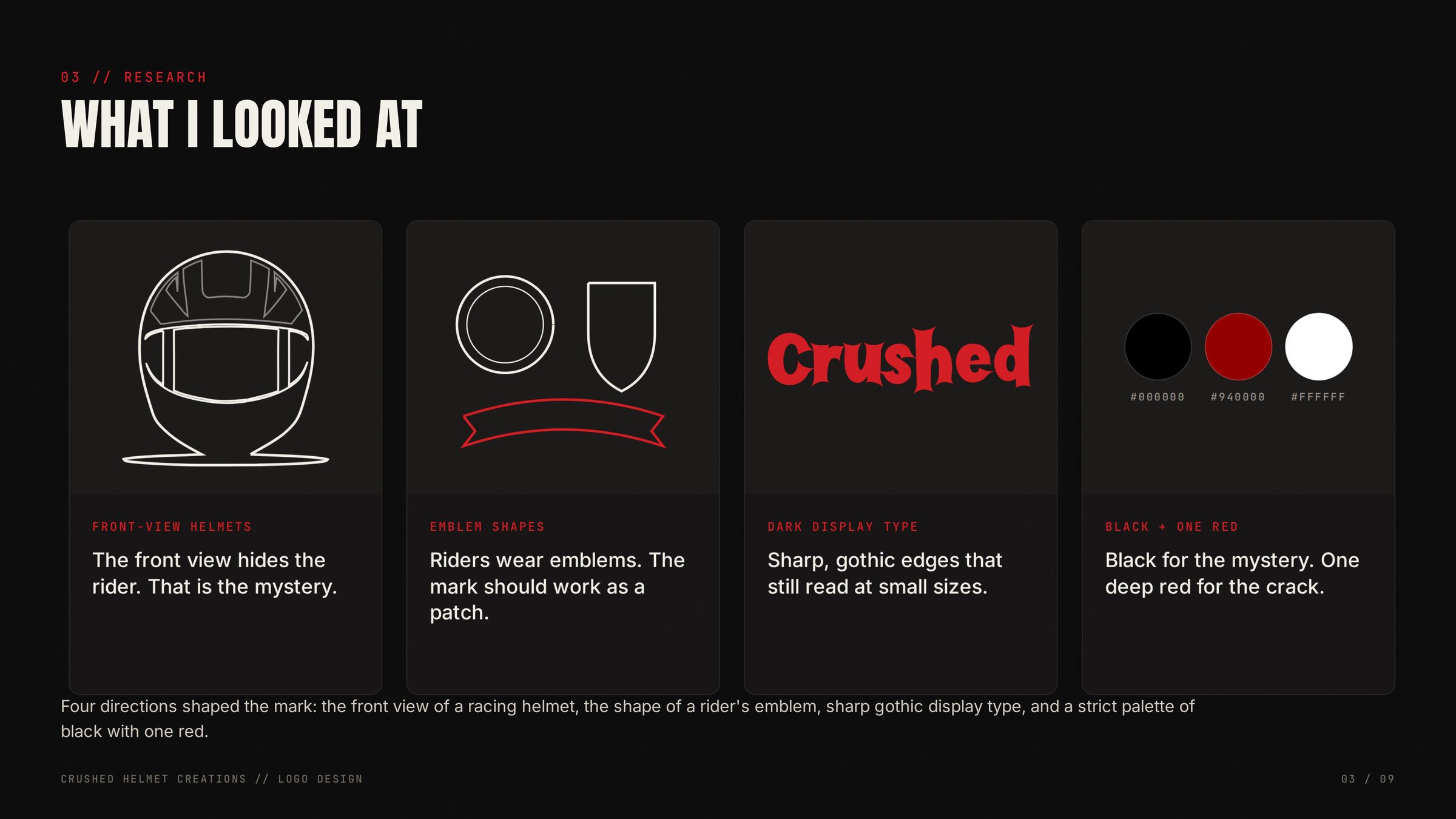
Front-view racing helmets, because the front view hides the rider. Rider emblems, because the mark should work as a patch. Gothic display type with sharp edges that still read small. And a strict palette: black for the mystery, one deep red for the crack.

Crushed Helmet research: helmets, emblems, gothic type
Four directions that shaped the mark.
Step 03Thumbnails

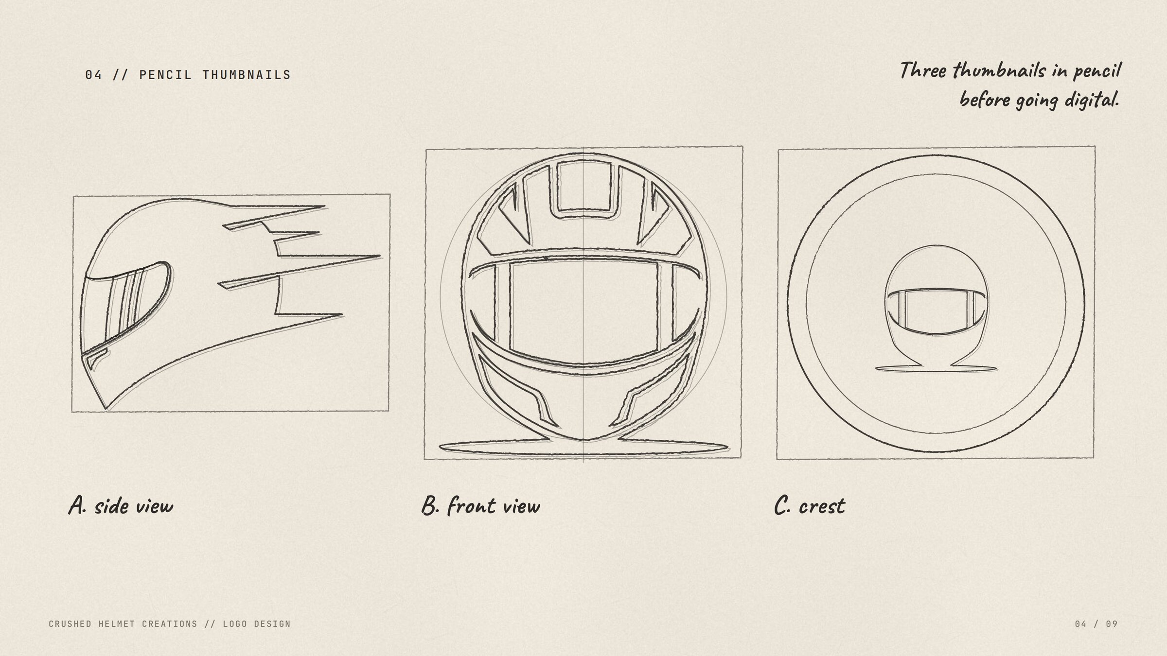
Three thumbnails in pencil before going digital.

A side view, a front view and a crest. Pencil first, so the shapes are decided before any tool gets involved.

Three pencil thumbnails for the Crushed Helmet logo
Step 04Revision

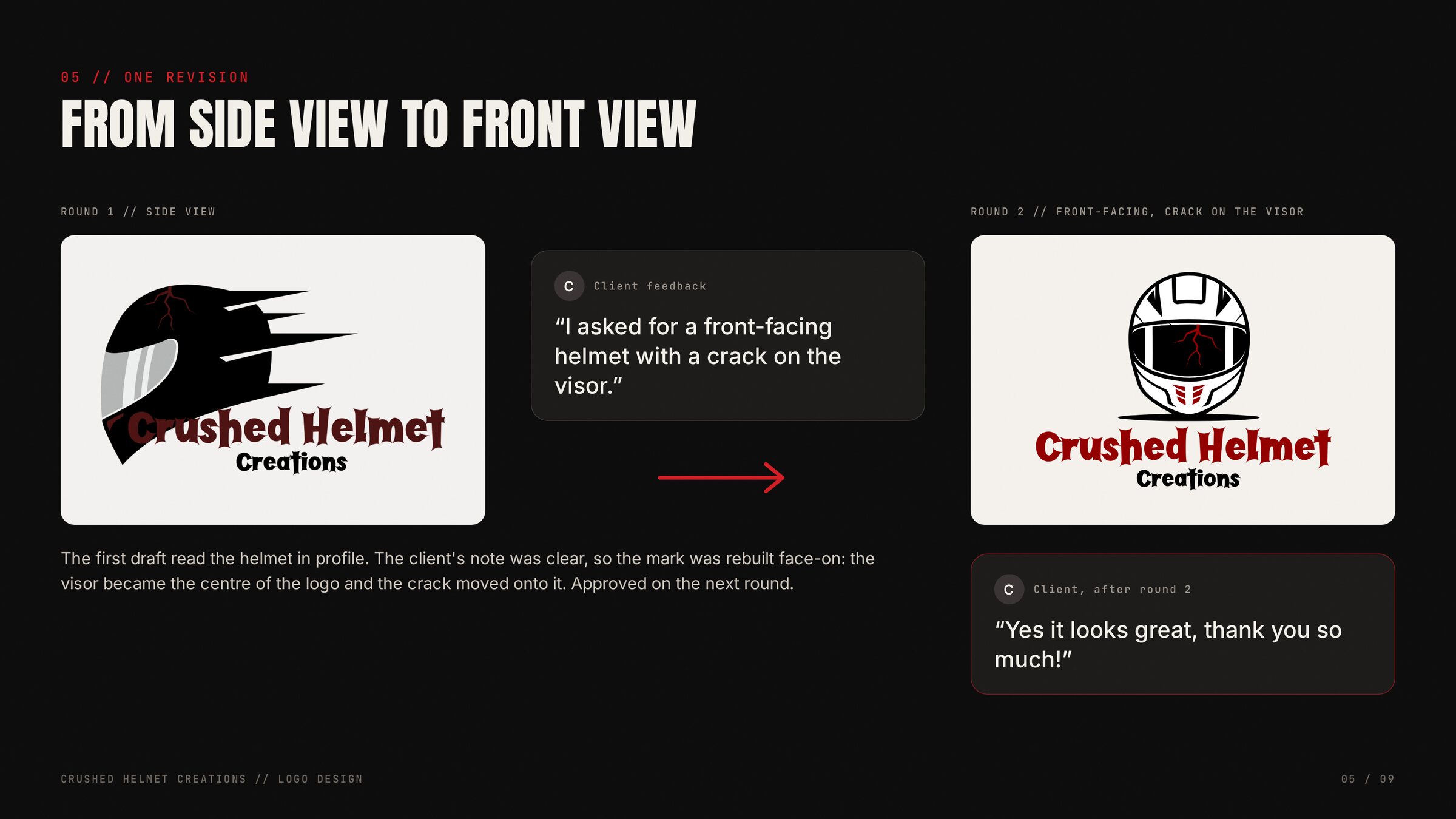
From side view to front view.

The first draft read the helmet in profile. The client's note was clear: a front-facing helmet with a crack on the visor. So the mark was rebuilt face-on, the visor became the centre of the logo and the crack moved onto it. Approved on the next round.

Crushed Helmet revision from side view to front view
Round one, the note, round two.
Step 05Vector build

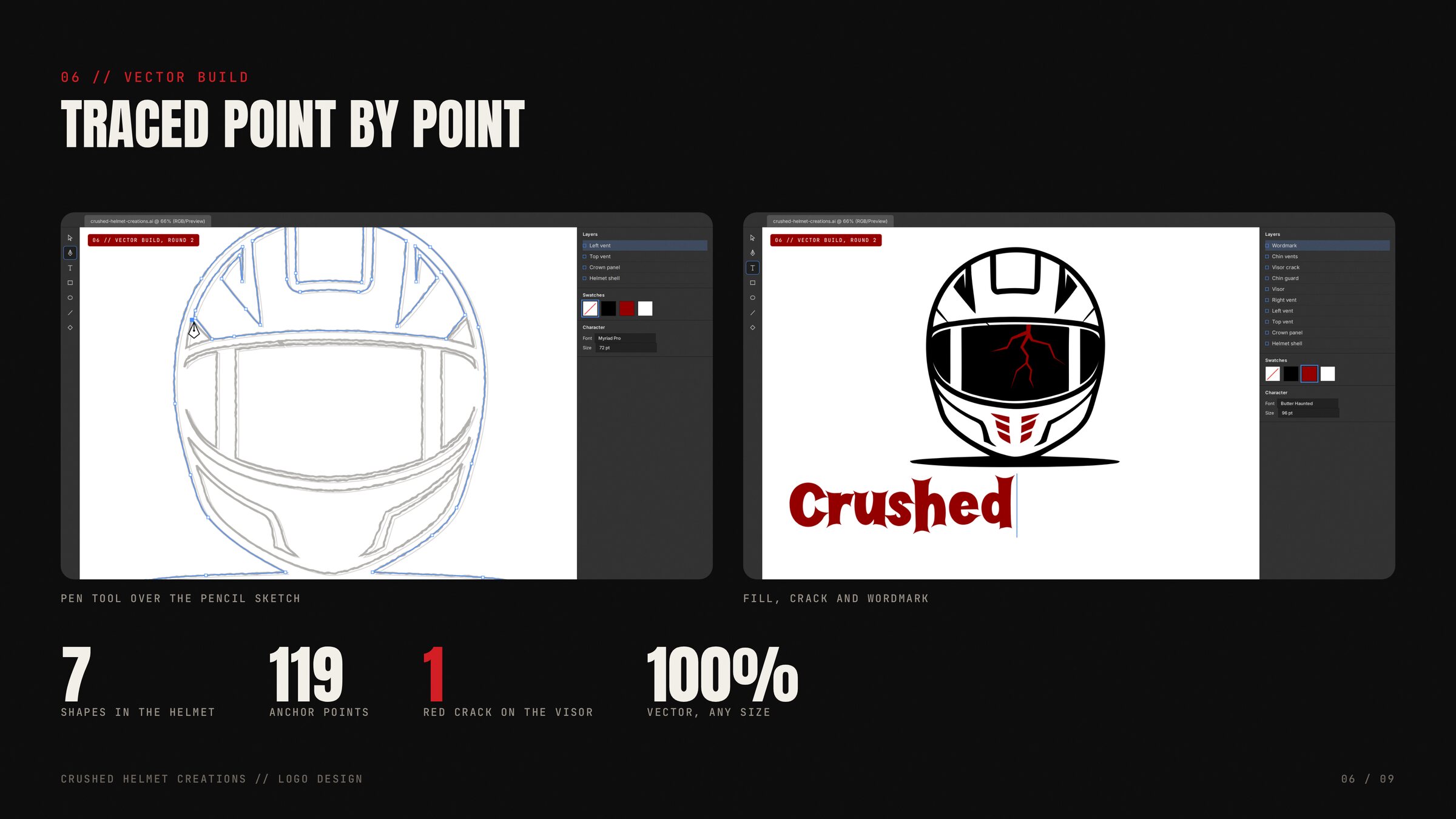
Traced point by point.

The pencil sketch went under the pen tool in Illustrator: seven shapes, 119 anchor points, then the black fill, the red crack, the chin vents and the wordmark. Every edge is vector, so the logo holds at any size.

Crushed Helmet vector build in Illustrator
Pen tool over the pencil sketch, then fill, crack and wordmark.
Step 06Logo system

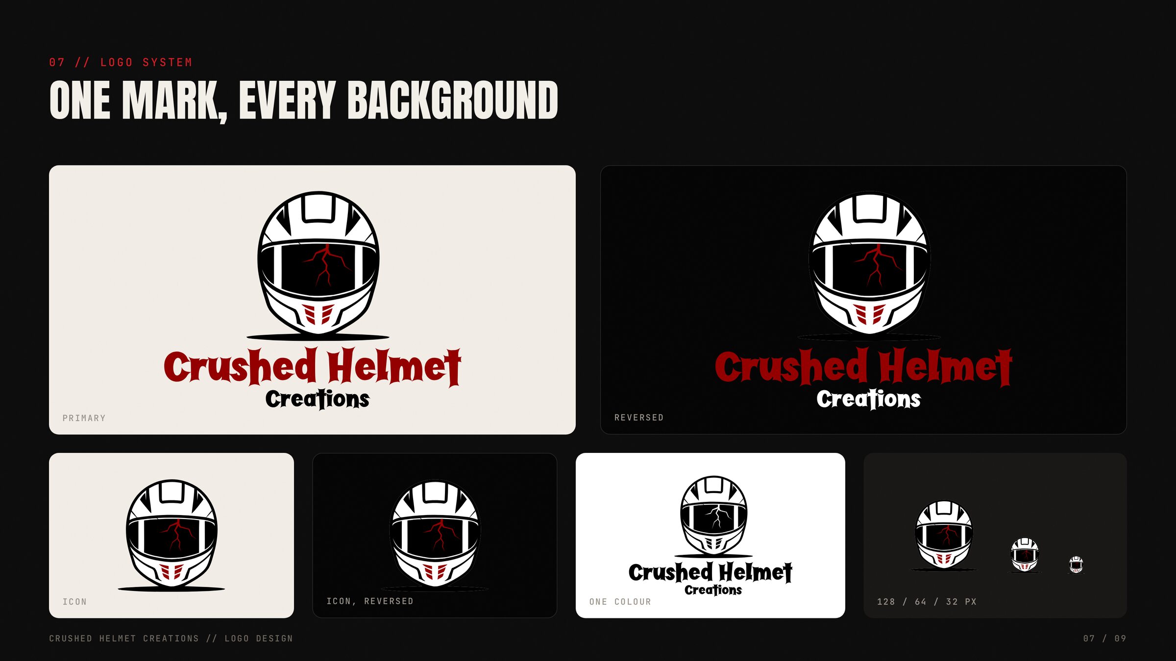
One mark, every background.

Primary on light, reversed on dark, an icon for small spaces and a one-colour version for print. Tested down to 32 pixels.

Crushed Helmet logo system across backgrounds
Step 07Colour and type

Black, one red, white.

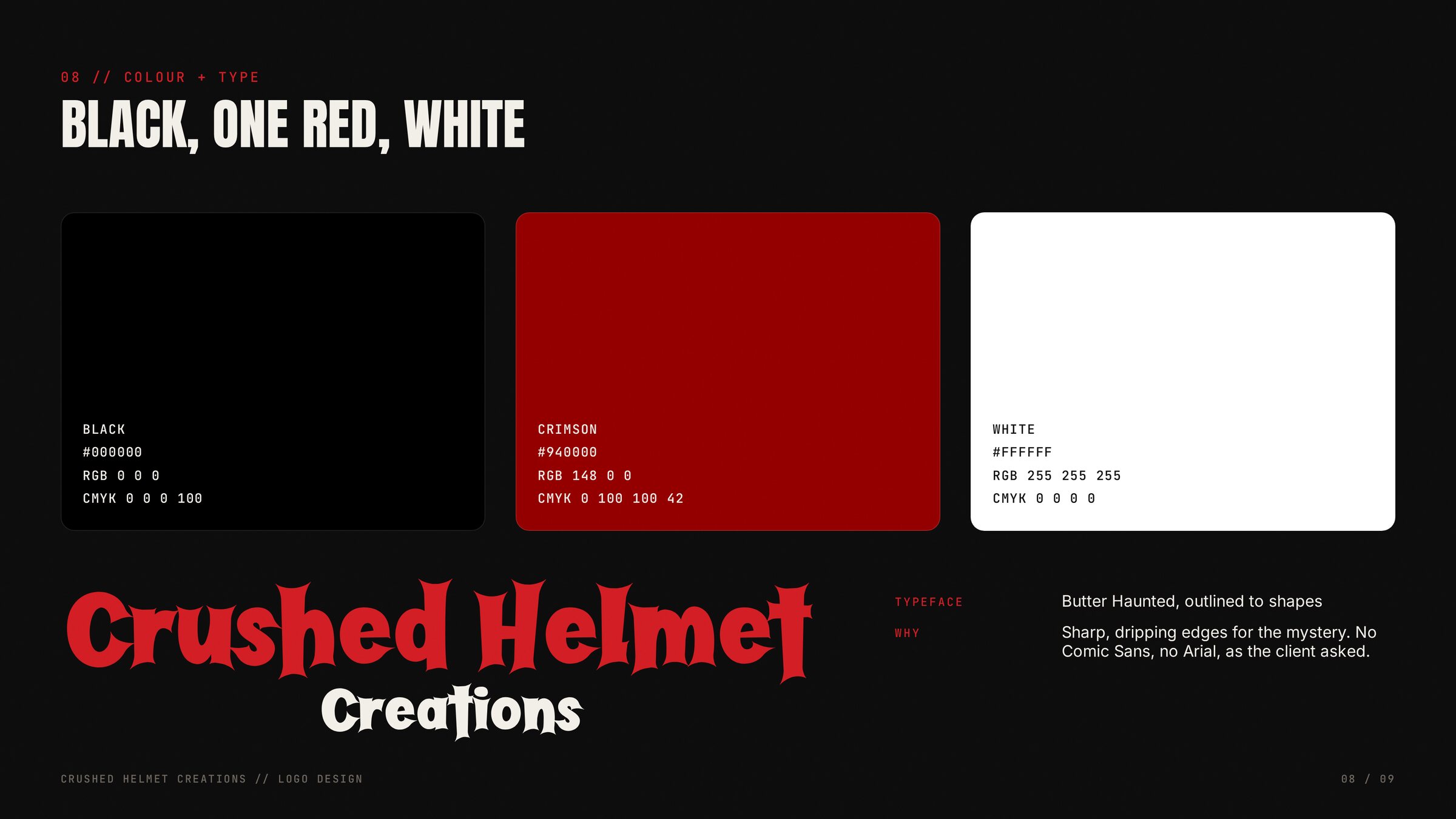
Three colours and nothing else. The typeface is Butter Haunted, outlined to shapes: the sharp, dripping edges the brief asked for, and none of the fonts it ruled out.

Crushed Helmet colour and type: black, one red, white
Step 08In use

Print and web.

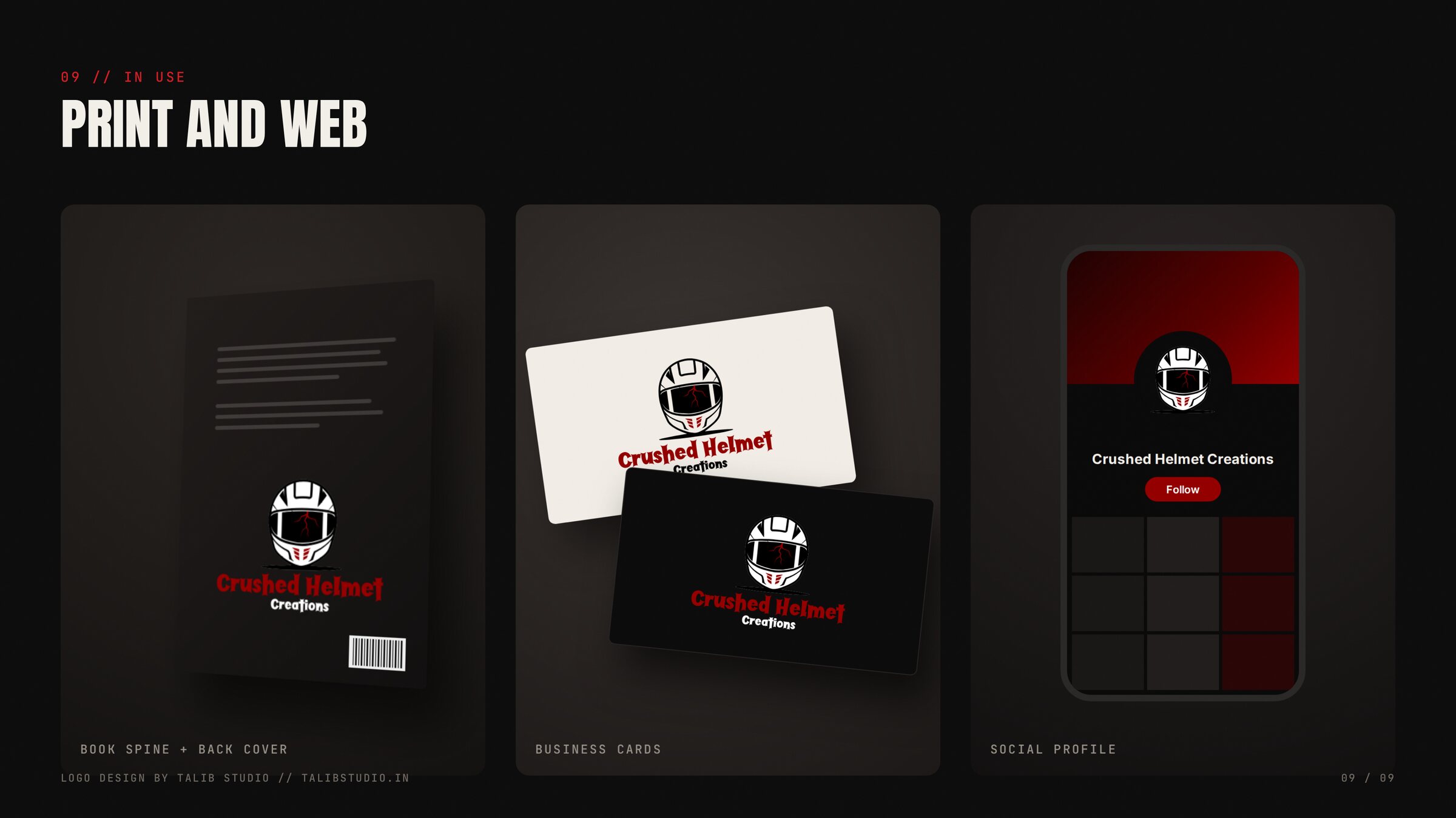
A book spine, business cards and a social profile. The process film below runs through the whole job in 75 seconds: brief, mind map, research, pencils, the revision, the vector build and the reveal.

Crushed Helmet logo in use: print and web
The logo process, start to finish.

What shipped

  • Primary logo on light
  • Reversed logo on dark
  • Icon for small spaces, tested to 32 px
  • One-colour version for print
  • Vector source (SVG and AI)
  • Print and web files (PNG at 3000 px)
  • Colour and type specification

Next case study

Nab Ul Hayat

See all work